I’ve recently changed themes on this site, from my own development of P2 Categories to Automattic’s TwentyThirteen. P2 Categories was not mobile friendly by default, and TwentyThirteen gives all my major notebook sites a cohesive look, making maintenance easier for me.
One thing I’ve noticed about TwentyThirteen is a small bug that’s been discussed several times around the web: when no header text elements are shown (under Appearance – Customise – Site Identity), a graphical header image disappears on mobile devices. Or more accurately, when the screen width changes to anything below 767 pixels.
If a site title and description are shown, the bug does not present itself, and instead the theme resizes the header image as well as the text without issues. That’s the behaviour I’m experiencing on both my 3D Dev Diary and my iOS Dev Diary.
I did some digging and found a suitable solution for this problem. Let me share it with you here.
How to test and how to fix this
To make the bug show up on a vanilla TwentyThirteen theme, you can either take a look at the theme on a real mobile device, or simply shrink the width of your favourite web browser. The theme adapts to these changes automatically.
When it shrinks below 767 pixels, the header pops out of view. When shrunk below 643 pixels, the menu at the top turns into a small drop down item to save even more room, still without the header coming back.
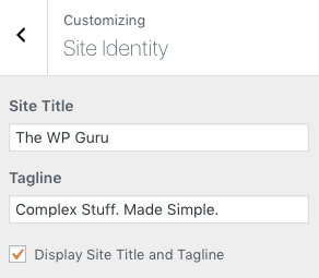
What we need to do to bring the header back is to display the site identity text (which is your site title and tag line). Although we do not want to see these words written out, because our header already contains those elements, they need to be displayed for the header to remain at all times.
To make these words disappear again, we’ll simply target them and set their opacity to nil, making them vanish again without a trace.
Re-appearing and disappearing the site identity
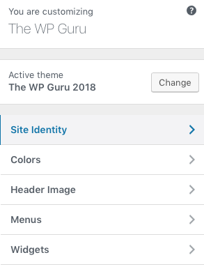
In your WordPress admin interface, head over to Appearance – Site Identity and tick the box that reads “Display Site Title and Tagline”. Then hit Publish at the top of the screen.
Don’t worry that you now have text showing on top of your header image. We’ll make that go away in a moment.


Next we’ll do some CSS tweaking. Add this code either under Appearance – Edit CSS, or add it to your child theme’s style.css file. Not into child themes yet? Fear not, my Child Theme Wizard plugin can create one for you at the speed of light.
/* invisibilise the site title and tagline */
.site-title, .site-description {
    opacity: 0 !important;
    margin-bottom: -40;
}
What we do here is to target the text in the header (namely the site title and the tagline) and set its opacity to nil, or in other words, make the text transparent. It’s still there, with the added benefit that when users click inside our header, they reach our home page – but no text elements will be displayed as a result.
Try it out and see if this fixes your problem of The Disappearing Mobile Header in TwentyThirteen.
Extra Credit: stop cutting off the bottom
I’ve noticed that the bottom of my header was cut off when shown on mobile devices. At the same time, my header logo had a little too much space showing at the bottom.
While I was in a CSS tweaking mood, I thought I’d take care of those things too. For this to be eradicated, I decided to target the three media queries responsible (desktop and two mobile breakpoints) by adjusting the margins.
/* adjust header margins */
.site-header {
    margin-top: -10px !important;
    margin-bottom: 10px !important;
}

@media (max-width: 767px) {
   .site-title {
    margin-bottom: 40;
    }
}

@media (max-width: 643px) {
    .site-title {
    margin-bottom: 45;
    }
}
Both of these tweaks adjusted my graphical header image nicely without showing any text elements on top of it.

Hello Jay, Thank you very much for your reply. Actually there was fault in my css coding which caused this issue. I have now solved this. Thank you once again!
Oh fantastic, I’m so happy to hear it 🙂