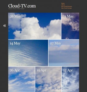
 One of my all time favourite themes is AutoFocus by Allan Cole – it’s a superb portfolio theme that lets your pictures to the talking. Great for sites that show off images.
I wanted to use it over at Cloud-TV but thought that a different colour scheme would better suit my pictures – so I took some notes on how to amend certain aspects of the theme. You may find these useful if you’d like to style the theme to your own needs.
Please note that at the time of writing AutoFocus is at Version 1.0.1 – it is likely to be the final standalone theme and it’s no longer under active development. These tweaks will NOT work for Autofocus Plus or Plus Pro.
Version Differences
There are THREE different versions of Autofocus out there:
- Autofocus 1.0.1 available from the WordPress Repository. You can get this simply by searching for “autofocus” under Appearance – Themes – Install New Themes. This is the version I’m discussing here. It is no longer in active development.
- Autofocus Plus (or Autofocus+) available from Allan Cole’s super unpronouncable site fthrwght.com. This is a child theme for the Thematic Framework. You need both these themes to run it. This version is in active development but not discussed here.
- Autofocus Plus Pro (or Autofocus+ Pro) also available from Allan’s site for a small fee.
I know this is confusing… that’s why I’m mentioning it here. Functionality is very different for the Plus version, which which we are not discussing in this article.
Background Colour
For my project I needed a darker background colour like grey. Have a look in the style.css file for these lines under the /* =structure */ section:
body{background-color:#FFF;color:#444;font:1.4em/1.6 "Hoefler Text", "Georgia", Georgia, serif, sans-serif;margin:0;padding:0}
Change the background-color value (#FFF) to something else like #333 to change its colour. Doing this will require a bit of tweaking on the old Page Titles – I’ll explain that further down.
If you’d like to add a background graphic, add the following code inside the {} brackets:
background-image: url('http://yoursite.com/picture.jpg');
Website Title
To change the size of your website title, have a look at this line of code under the /* =header */ section:
#header h1 {font-size:1.8em;line-height:0.8em;padding:5px 0 0;}
Change font-size to 3.8em for something with a lot more impact. The title is defined by the default link colour (since the title is a link) – if you’d like to change this independantly from the link colour, add this bit of code (it’ll make the title red):
#header #blog-title a {color:#f11;}
If you’d like to change the colour of the tag line, change the value in this bit of code:
#header #blog-description {color:#888;}
Adding a Header
To add a header graphic to this theme, have a look at the header.php file and find this bit of code:
 <div id="header">
 <h1 id="blog-title"><a href="<?php echo get_option('home') ?>/" title="<?php bloginfo('name') ?>" rel="home"><?php bloginfo('name'); ?></a></h1>
 <div id="blog-description"><?php bloginfo('description') ?></div>
 </div><!--  #header -->
Change the second line to something like this:
<h1 id="blog-title"><a href="<?php echo get_option('home') ?>/" title="<?php bloginfo('name') ?>" rel="home"><img src="http://yoursite.com/yourlogo.jpg"></a></h1>
Make sure your header is not too big, otherwise it’ll obscure the nav menu. Delete the second line if you don’t want WordPress to display your tag line.
Default Link Colour
To change this, go back to the style.css file and have a look for this inside the /* =miscellaneous */ section:
a{color:#444;display:inline;}
a:hover{text-decoration:underline;color:#000;}
You guessed it: the first line changes the link colour, the second line deals with what happens when you hover. Sweet! Notice that changing either value will have an effect on the site title and all items in your Nav Menu, unless you override those individually.
The Nav Menu
The Nav Menu is called from within the header.php file via a function which lives in the functions.php file. Here’s the full php code you need to find:
// Produces a list of pages in the header without whitespace
function sandbox_globalnav() {
 echo '<div id="menu"><ul><li><a href="'. get_settings('home') .'/" title="'. get_bloginfo('name') .'" rel="home">Home</a></li>';
 $menu = wp_list_pages('title_li=&sort_column=menu_order&echo=0'); // Params for the page list in header.php
 echo str_replace(array("\r", "\n", "\t"), '', $menu);
 echo '<li><a href="'. get_bloginfo_rss('rss2_url') .'">RSS</a></li></ul></div>';
}
By default, every page you’ve got in your WP installation will be shown. That may not be what you want. Instead, you could write a link to every page you want to show like this:
function sandbox_globalnav() {
echo '<div id="menu"><ul><li><a href="'. get_settings('home') .'/" title="'. get_bloginfo('name') .'" rel="home">Home</a></li>';
?>
<li><a href="yoursite.com/page1/">Your First Page Here</a></li>
<li><a href="yoursite.com/page2/">Your Second Page Here</a></li>
<?php
echo '<li><a href="'. get_bloginfo_rss('rss2_url') .'">RSS</a></li></ul></div>';
}
If you don’t care for the RSS Link at the bottom of that block, delete the entire line and replace it with
echo '</ul></div>';
You can also change the size and colour of the entire nav block – have a look at the sttle.css file for this. Under the header section you’ll find a block of code – we’re only interested in the very last line which describes text in the nav menu:
/* =header */

...

#access #menu a{font-weight:800;}
If you wanted to make it red and slightly bigger for example, amend that last line to this:
#access #menu a{font-weight:800; color: #f00; font-size: 1.2em;}
Add tags to your heart’s content.

Jay, it didn’t work. Am I missing something? Thanks for your help!
See it at:
johnrandrews.wordpress.com
Ah, interestingly the self-hosted version uses a class whereas the WordPress.com version uses an ID. Try the following instead and let me know if it works:
#entry-content {text-align: center;}Hmmm… strangely still now working. Any other ideas? Thanks Jay!
I think it works – the text on your about page is centred as far as I can see: http://johnrandrews.wordpress.com/about/
Yeah, but I just want to be able to center the posts, not necessarily pages. Such as this page: http://johnrandrews.wordpress.com/2012/08/21/editorial-photography/
How do I do that?