JetPack 3.0 was released yesterday and it had quite a facelift: a new menu structure, dozens of graphical tweaks and a new set of Social Icons for sharing your posts. Those work well out of the box in TwentyThirteen and TwentyFourteen – but not in P2. Here’s how we can fix the problem.
First let me show you what we’re actually fixing here. In JetPack 2.9.3 and before the social sharing icons at the bottom of a post looked like this:

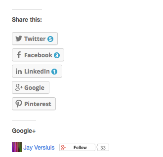
After you upgrade to JetPack 3.0, and if you’re running P2, then those icons are stacked up like this:

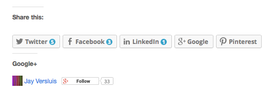
Not what we want, and not how it’s meant to be. What we really want is something like this – new icons, but in the same row as before:

And here’s how we can make this happen – with a hint of CSS:
/* fix JetPack 3.0 Sharing Icons */
.sd-content ul li {
    float: left;
}
I’ve only noticed this with P2 1.5.3 – but if you’re using a theme that causes the same problem, just add the above to the bottom of your theme’s style.css file, or add it to the “Edit CSS” box (under Appearance).
It’s not a perfect solution, but certainly a compromise for the interim.
Hope this helps 😉

The Social Icons are meant to be displayed next to the “Share This” text of course – but I didn’t manage to make this happen yet in P2. Any improvements suggestions are welcome of course.