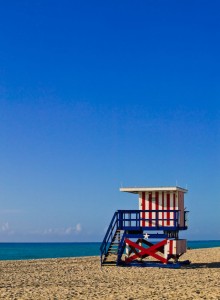
 I wanted to use Mansion for my Miami Beach Huts website. It was ideally suited, however all my images are portrait instead of landscape. Some tweaks were necessary which I thought I’d share with you for endless hours of fun.
I wrote this for Version 0.2 of this theme. A few things have changed since then, especially the documentation. Keep that in mind while I’ll talk you through some tips and tricks of MANSION.
Since we’re playing around with the thumbnail sizes and orientations, the first thing you want to do is install an invaluable plugin called AJAX Thumbnail Resize by Junkcoder. It does exactly what it says on the tin: resize your existing thumbnails. This way you don’t have to worry about posts from the past – they’ll still look great when you upgrade to a new theme like this.
Picture Sizes
For each picture you upload, WordPress automatically creates three different sizes on the fly: Thumbnail, Medium and Large. These are saved with your original image file.
Mansion uses the Thumbnails to generate all pictures on the home page and then links each picture to the post it’s embedded in. To make them look good, the default thumbnail size needs to be set to 200×150 pixels (under Settings – Media). Make sure the box “crop tuhmbnails to exact dimensions” is ticked.
So far so good. If you’re writing a new post and you’ll upload a few pictures with it, all thumbnails will resize correctly. If you’ve previously used a different thumbnail dimension you can use the aforementioned AJAX Thumbnail plugin to rebuild them all to fit Mansion.
The readme file also suggests sizes for medium and large images (495px and 960px) – we’ll see how that affects single posts and pages a bit later.
Orientation: using Portrait instead of Landscape
For my project, all my pictures are portrait instead of landscape – so instead of 200×150 thumbnails I’d like to use 150×200 ones. Changing the size alone and rebulding all thumbnails creates rather big black gaps in between them, so we need to tweak the style.css file a bit.
Find the following code and tweak the WIDTH value to your own needs. Say you have 150 pixel wide thumbnails, set it accordingly.
/* Logo description styles */

#header {background: #333; width: 200px; float: left; }
The Height of the Nav-Box
You may have noticed that when you use a different width for your thumbnails, this will have an effect on the Nav Box. Let’s make sure it’s exactly twice the height of your thumbnails and the front page should have a good grid layout again.
Let’s look at style.css one more time – find this near the previous piece of code:
#header .menu {min-height: 150px;}

#header .logo {height: 150px; position: relative}
These lines together effectively make up the size of the nav box. The bottom one sets a size for your “Logo” (in this case just the text), and the top line will dynamically expand depending on how many pages and categories you’re showing.
Play with these values depending on your thumbnail size. In my case, if you’re showing 8 items in the list, 99px for the “Logo” works fine.
You can also make this size static by replacing “min-height” with “height”, but you may find that if you add more items (categories or pages) some of them won’t be showing. You could then just make the box bigger in multiples of your thumbnail height.
The Width of the Search Box
The integrated search box is made for a 200 pixel wide nav box. Since we just made that a bit slimmer, part of it now gets cut off. Fear not, for help is at hand – take a look at this piece of code in style.css (under Navigation Styles):
#nav #s {background: #2c2c2c url(images/search.png) 1px 3px no-repeat; border: 1px solid #222; width: 157px; color: #666;font-size: 11px; padding: 4px 4px 4px 16px; font-family: "Lucida Grande",Arial;}
The width value is the culprit – set that to something like 110px for 150px wide thumbnails. Feel free to play around with it to find a size that suits you.

Hi Victor,
thanks for the help!
This is great.
The logo addition didn’t work in nav.php but made it work in header.php
You’re welcome!
I’m Jay… he’s Victor 😉
Hey thanks for the info!
I’m still tweaking my Mansion, is there a way of making the blog theme the primary one?
I tried copying theblog style into the index.php and got everything scrambbled lol 😛
Thanks again!
thanks for your help jay!
If i load an image as the featured image… (thumbnail) then add another image into my actual post.. my homepage (the index) actually displays both the pictures… how can I stop this from happening?
Hi Victor,
actually in the latest version of Mansion the Featured Image overrides the first picture in the post. Older versions of Mansion (0.2 I remember) used to show all images in your post – which I would imagine includes the featured one.
In a nutshell I reccommend upgrading to 1.2.1 or later. Hope this helps 😉