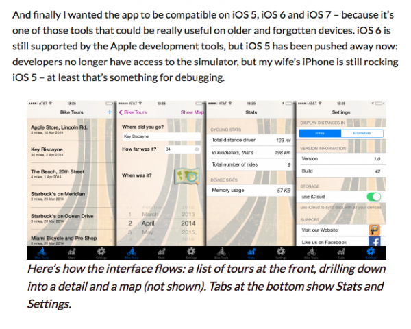
I love the Twentythirteen theme – except for the captions that appear underneath images. If you’ve ever seen them they look so out of place as if someone forgot to style them altogether. Here’s what they look like by default:

Notice how the captions are actually larger than the post text. I wanted to drop this size a bit, but at the same time integrate the text better with images I post over at http://www.versluis.com, adding a bit of padding, some rounded corners and perhaps tint the background colour ever so slightly.
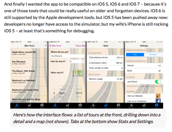
Here’s what I came up with:

And here’s how I did it:
 /* make captions smaller */
 .wp-caption .wp-caption-text {

	 font-size: 1.0em;
	 background-color:#f7f7f7;
	 padding: 10px;

	 -webkit-border-bottom-right-radius: 10px;
	 -webkit-border-bottom-left-radius: 10px;
	 -moz-border-radius-bottomright: 10px;
	 -moz-border-radius-bottomleft: 10px;
	 border-bottom-right-radius: 10px;
	 border-bottom-left-radius: 10px;
 }
Add this to your theme’s style.css file or override your stylesheet with an appropriate option. Here’s what this code does:
First we’ll reduce the 18 point caption size and bring it in line with the rest of the post text (1em). Then we’ll tint the background colour to a very light hint of grey. We’ll also add a bit of padding around all edges of the text, it looked a bit cramped in there before.
The second larger block is creating rounded corners at the bottom of the caption, but not at the top so it looks like an attachment. There’s a remarkable tool that lets you visually set this and return some code at http://border-radius.com – go check it out and have a play.

2 thoughts on “How to style captions in Twentythirteen”