
I’ve been using VS Code’s git integration successfully for years without ever really understanding how the UI works. Recently I sat down and worked it out properly, and I came away with a thesis: VS Code’s git support is complete, but it’s organised by implementation logic rather than user logic. Every feature exists. The problem is where they all live. Here’s the tour I wish someone had given me.
Three menus that all mention branches
The first source of confusion: there appear to be three different places to “pick a branch”, and they behave differently. It looks like doubled-up features. It isn’t — it’s three different features that happen to all mention branches, and VS Code does a genuinely poor job of telling them apart.
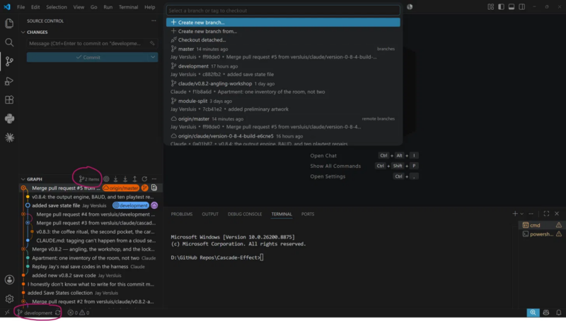
The bottom-left status bar is the real one. It shows which branch is currently checked out, and clicking it opens the checkout picker. Single-select, because you can only be on one branch at a time. The little sync icon next to it pulls and pushes.
The “2 Items” control next to the Graph header is purely cosmetic — it’s a display filter for the commit graph below. That’s the one with tick boxes: you’re choosing which branches to show in the history, not which one to switch to. Multi-select, because you can visualise as many branches as you like at once. Ticking and unticking things here changes nothing in your repo. Once you realise this, it’s actually rather useful — tick two branches and it becomes a visual way to compare them, showing where their histories diverge and converge.
The list at the top isn’t a fixed panel at all — it’s VS Code’s generic “quick pick” dropdown, and it shows whatever the thing you just clicked asked it to show. Click the status bar → single-select checkout list. Click the graph filter → multi-select tick boxes. Same container, different contents. That’s why it seems to change personality: it’s not one menu, it’s a chameleon.
The merge treasure hunt
Checkout lives in the status bar. Merge — checkout’s conceptual next-door neighbour — lives somewhere else entirely: hover over the CHANGES section header in the Source Control panel, and only then does a ⋯ overflow menu appear, containing Branch → Merge…
This is bad for two compounding reasons. First, hover-only menus are invisible by definition — you can’t find what doesn’t appear until you’re already in the right place. Second, the Source Control panel lets users disable the Changes section entirely, and without it there’s no merge option in the panel at all. An essential operation, attached to an optional, invisible menu. (Full walkthrough in How to merge Git branches in VS Code.)
“Sync” isn’t a git command
The prominent “Sync Changes” button has no git equivalent — “sync” is pure VS Code vocabulary. Under the hood it simply runs two commands back to back:
git pull
git push
Pull first, then push — because if the remote has commits you don’t, git will refuse your push until you’ve incorporated them. The status bar even shows you the plan before you click: 1↓ 2↑ means one commit to pull down, two to push up. If either side has nothing to do, that half is a no-op. And if the pull half hits conflicting changes, you get an ordinary merge conflict — sync does nothing magical to prevent that. (There’s also a git.rebaseWhenSync setting that swaps the pull for git pull --rebase; it’s off by default.)
To be fair to VS Code for once: pull-then-push is exactly what the word “sync” suggests. This one’s a reasonable abstraction — it’s just never explained anywhere.
Two unlabelled boxes and a misplaced push
Create a tag and VS Code asks you two questions in two identical-looking, unlabelled input boxes. The first is the tag name, the second is the tag message — it’s creating an annotated tag, which is the right default, but nothing on screen tells you that. Guess wrong (as I did) and you end up with a tag named like a sentence.
And then the punchline: git push doesn’t push tags, so there’s a separate Push Tags command — which does not live next to Push, where every user would look for it, but under Tags, in that same hover-only menu. The one command everyone forgets, filed under the menu nobody opens. (Details in How to create and push Git tags in VS Code.)
How this maps to the command line
Part of why the UI feels incoherent is that the command line mapping is scattered. One command, one idea — but the UI splits related ideas across unrelated locations:
git checkout   → status bar, bottom-left
git merge      → hover menu on Changes → Branch → Merge
git pull/push  → "Sync Changes" (both at once)
git tag        → hover menu → Tags → Create Tag (two unlabelled prompts)
git push --tags → hover menu → Tags → Push Tags
(everything)   → Ctrl+Shift+P → "Git: ..."
That last line is the real survival tip: the Command Palette is the escape hatch. Every git operation is in there under “Git: …”, flat and searchable — which rather proves the point that the features were never the problem.
What would make more sense
None of this needs a redesign, just a re-filing. Put Merge in the branch picker, next to checkout, where its conceptual cousin lives. Label the two tag prompts “Tag name” and “Tag message” — two words each, mystery solved. Offer Push Tags in both places: under Tags for the purists, next to Push for the humans. And promote the overflow menu on Changes to an always-visible icon, so essential operations don’t hide behind a hover on a section that can be switched off.
Until then: the status bar switches, the graph filter compares, the quick pick is a chameleon, sync is pull-then-push, and everything you can’t find is in the Command Palette. Once you know the map, the territory is fine.