By default, the TwentyThirteen theme suppresses the date byline when a post is marked as Sticky (in which case, it’ll always be displayed at the top of the posts list).
That’s usually great, because Sticky Posts are often timeless announcements, and the fact that they’re a year or two out of date doesn’t look as handsome as if the date byline would simply be removed. I like this as a default behaviour.
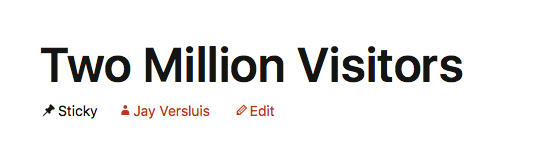
Here’s what a default sticky post looks like, without the date displayed:
But of course, every now and again you may want to break the rules and shake up the whole universe. I did this on my iOS Dev Diary recently, where an announcement post would have been very helpful with the date displayed (I didn’t intent to keep it there for long).
So how do we bring back the date on Sticky Posts in TwentyThirteen? Let’s find out!
Read more
