
 Have you ever wondered how a website can look great on your desktop and appear reformatted on your phone? The secret sauce is done via CSS Media Queries.
In a nutshell you define your styles for larger screens, and then override those styles with more mobile friendly options if the screen is smaller. You can specify the exact width which allows even to detect if someone is holding their device portrait or landscape.
Let’s look at how this can be accomplished with CSS rules.
 Sometimes “new” doesn’t always mean “better” or “suitable”.
  Plesk allows you to create custom buttons to the control panel, complete with logo and URL. Since Plesk 11.5 you can even choose in which part of the panel your buttons shall be displayed.
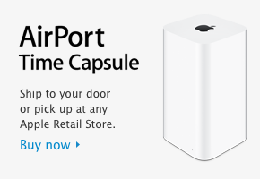 I had an odd problem the other day: I wanted to restore a fairly large folder from my new AirPort TimeCapsule. But the restore always stopped at one particular file, with an error message about permission problems.
 Every once in a while it can happen happen that use use “yum update” to update your Linux system.
  I’ve just ordered a new Dynamic Cloud Server with 1&1 with a total of 800GB disk space. They rock, but they come with a minor inconvenience: due to the way these server instances are allocated, 1&1 do not automatically extend the partition for you – so you can’t actually start using the full amount you’ve ordered.